
What a two-year-old’s dinner chair taught me about solving the right problem and why it matters in building automation.
Our daughter is two. She’s happy, curious, full-tilt from sunrise to sundown. And every evening at dinner, she was a tornado.
We assumed it was the hour. End of a long day at daycare, running hot, wound up. So we did what any reasonable person does at dinner time: we solved the problem in front of us. We strapped her into her high chair. Contained. Settled.
She screamed. Every time.
We hadn’t solved anything. We’d just added constraint to a problem we hadn’t actually diagnosed yet.
So we stopped. And we asked a better question.
Why would a two-year-old be restless after a full day at daycare? We thought about her day. The noise, the movement, the overstimulation. We thought about her preferences. She always wants to sit with Mommy or Daddy. She gravitates toward the soft chairs. She’s tactile. She notices comfort immediately.
And then it landed: she was uncomfortable.
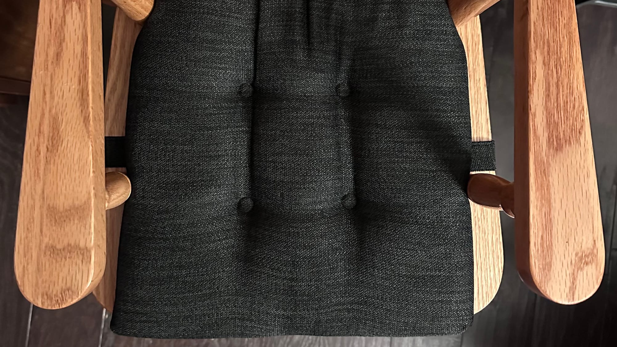
Her high chair—a beautiful handmade oak piece—had no cushion. No give. No warmth beneath her. It wasn’t where she wanted to be, and her body knew it before we did.
We added a tufted memory foam pad. Same chair. Same family dinner. Completely different experience.
The chair didn’t change, our understanding of her situation did.
That's not just a parenting win, it's rooted in design principle. Proper problem framing ensures you are solving the correct problem in the first place.
Good design isn’t about having better ideas. It’s about asking better questions—and being willing to sit with the discomfort of not knowing long enough to find the real answer.
In UX, we call the first instinct—the constraint solution—a solution in search of a problem. You see a behavior. You suppress it. You declare victory. But you haven’t asked the most important question a designer can ask: What is the user actually experiencing?
The behavior was never the problem. The discomfort driving it was. And until you reframe around the person. Their context, their day, their sensory reality. You’re just adding buckles to a bad seat.
This is the difference between designing for users and designing with them in mind. One produces features. The other produces experiences people don’t want to leave.
Why this matters in building automation.
Most integrators spend their working lives inside the Niagara Framework. Tridium’s comprehensive platform that connects building systems, normalizes data across devices, and serves as the backbone of smart building infrastructure worldwide. With over a million instances deployed across hundreds of thousands of projects globally, Niagara is the industry standard. It is powerful, proven, and purpose-built for the complexity of real-world building automation.
But powerful infrastructure and great user experience are different things entirely.
Niagara gives integrators the tools to create custom user interfaces for end users. But those tools were designed around system capability, not human comfort. The result is a space full of technically proficient interfaces that are genuinely hard to work in. Dashboards that bury critical information. Workflows that demand deep platform knowledge just to navigate. Screens that feel like they were designed for the system, not for the person managing it at 6am when something flags red.
These aren’t failures of the platform. Niagara does what it’s built to do exceptionally well. But the user experience layer—the part integrators and facility teams actually touch every day—has been left largely to fend for itself.
The industry response, historically, has been more configuration. More documentation. More workarounds dressed up as features. Nobody stopped to ask the right question: why does this feel hard for the person doing the work?
When I joined NiagaraMods, I found a team already asking it.
I’ll be honest, when I walked into my interview, I expected a capable engineering shop. What I found was something rarer: a team with a genuine design eye, built from the ground up by founders who understood that exceptional software isn’t just architecturally sound—it’s human.
That conviction didn’t live on a slide deck. It was baked into how decisions were made, how problems were framed, how the product roadmap was discussed. Engineers who talked about craft. Leadership who valued design not as an aesthetic layer, but as a strategic one. Founders who had quietly been making a name for NiagaraMods in the BAS space by doing what most in the industry wouldn’t: building with the end user at the center, not as an afterthought.
I came in as Principal UX Designer, joining our Co-founder and Creative Director, Zach Overholser to form the design team at NiagaraMods. The standard we work to wasn’t something I brought in. It was already here, set in-place by the founders themselves. Our Creative Director, Zach and Technology Director, Adam Bergman—who built the culture around one shared belief:
Craft and rigor aren’t in tension—
they're the same thing.
In a space where design leadership is often an afterthought, finding a company that treats it as a competitive advantage felt like finding the cushion on the chair.
That product is Reflow 2.
Reflow 2 is NiagaraMods’ answer to the experience gap. A modular, scalable BAS interface built specifically for the Niagara ecosystem, designed from the ground up around the people who live inside it every day. Integrators. Facility teams. OEMs. Building owners. People who are exceptional at their jobs and deserve software that meets them there.
We didn’t start with features. We started with people.
We asked why integrators were frustrated. Why the work felt unnecessarily hard. We mapped the real moments of friction: the context-switching, the rigid layouts that couldn’t adapt to a site’s complexity, the interfaces that demanded deep technical knowledge just to navigate. We sat with the discomfort instead of patching over it.
Then we built from the ground up around what users actually need: clarity, speed, flexibility, and software that respects the skill of the person using it.
Reflow 2 introduces Projects.
A powerful container that groups content, streamlines workflows, and brings real clarity to complex systems. Teams can build fully interactive dashboards, save multiple drafts, and decide exactly when to push a project live. A new block editor delivers total layout flexibility through an intuitive drag-and-drop experience—arranging, styling content, and binding system data, faster than ever. With zero code and no frustration. And because buildings operate across borders, Reflow 2 ships with full internationalization support for over 20 languages out of the box, with light mode, dark mode, and visual themes that adapt to every environment and every user.
The result is a platform that removes the distance between experienced professionals and the work they’re trying to do. One that scales from a single building to an enterprise portfolio. One that gives integrators a modern, differentiated software solution they can bring to clients. And a real, scalable revenue opportunity in doing so.
Reflow 2 is human-centered design meeting industrial-grade capability. And in a category that accepted mediocrity as the default for far too long. Reflow 2 doesn’t just raise the bar on user experience. It obliterates it.
The lesson that lives in a dining chair.
Good design isn’t about having better ideas. It’s about asking better questions—and being willing to sit with the discomfort of not knowing long enough to find the real answer.
My daughter wasn’t the problem—the seat was.
Your integrators aren’t the problem—the software is.
Reframe the context. Meet the user where they are. Build for the experience they deserve—not the one that’s easiest to ship.
That’s the work. That’s always been the work.
Andrew is Principal UX Designer at NiagaraMods, where the standard was set by the founders, is upheld by the team, and felt in every pixel of Reflow 2.
Learn more and request beta access at reflowui.com
