
We're not just talking about equipment graphics here. The majority of building automation system (BAS) front ends are average at best.
First off, we must define a BAS "front end". In the simplest terms it is the building automation system user interface and graphics for access, view and control.
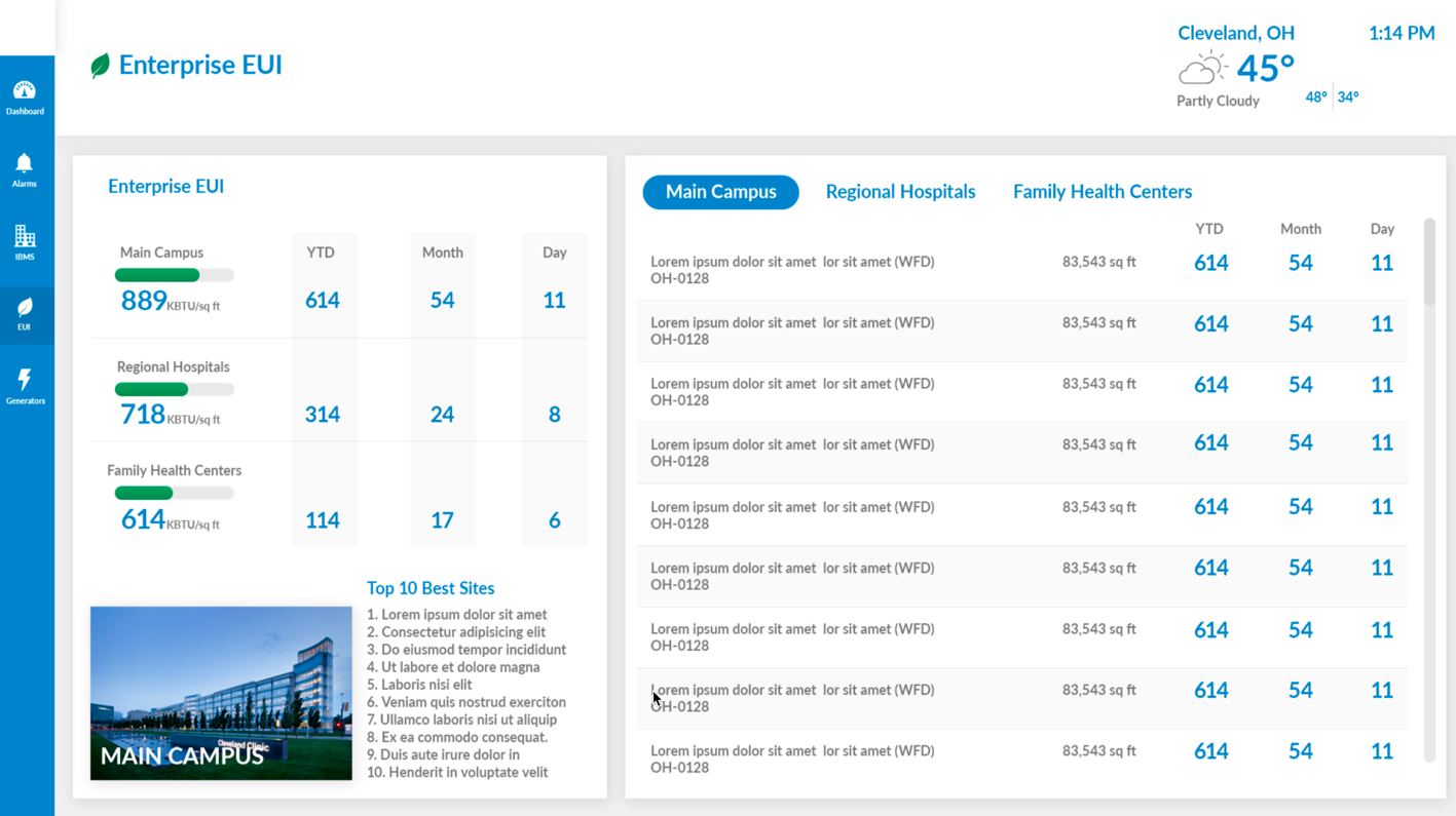
We spend so much time on BAS graphics because it is the customers' only true view in to their system, but the majority of BAS techs seem to over-engineer this area of the job. Remember, site graphics need to be clean, functional and responsive in design.
I propose that following these 3 quick tips will set you on a path to proper graphical designs that your customers will love.
Tip #1: Nail the Nav
Kudos on the awesome graphics, but how much time did you spend on site navigation? Most times it is the last process in site building. The vast majority of the systems on the market today have built in navigation tools that are terrible. You could argue that they get the job done and you may be okay with using these tools, but are you considering the user that is accessing this system nearly every day?
Things to consider during the navigation design phase:
- Can the user get to all parts of the system easily?
- How many clicks does it takes to get to x?
- Did you test each target?
- Does the user know where they are in the system at all times?
Tip #2: Deal with the Data
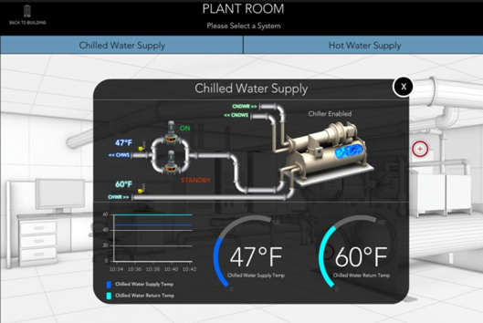
So you've done a great job on the navigation. Now, let’s concentrate on the data set. My air handling unit has 125 total points available. I need to display every single point on my graphic, right? Wrong!
I appreciate a detailed AHU flow graphic packed with all of the data points just as much as the next tech. But how much time is spent on making sure every single data point finds a place on the screen? Little to no effort is put towards understanding the critical data points that should be displayed and differentiating them from the non-critical data.
Things to consider during the data point mapping phase:
1. What points are the most important to validate the operation of the system?
2. Have you considered display of the other points in a list on another page?
3. How is your use of negative space?
Tip #3: Tackle the Tech
Have you ever heard of responsive web design? Most main stream BAS software platforms are now claiming they support responsive design. How much time do you spend designing and testing your site on a mobile device? Too often, the answer is not enough or not at all – most users of the BAS will steer clear of using their mobile tech to access the system because of poor responsive support or design.
Things to consider during the graphics design phase:
1. Does your system support HTML5 and responsive design? (No? It's time to find a new system)
2. Did you test each page in the common browsers? (mobile and desktop, Google Chrome, Mozilla Firefox, Microsoft Edge, Microsoft Internet Explorer 11, and Apple Safari)
3. Are there HTML5 web widgets available to spice things up?

For graphics help, more information, and detailed how-tos stay tuned to our blog or reach out to me directly at jerry@niagaramodules.com.
