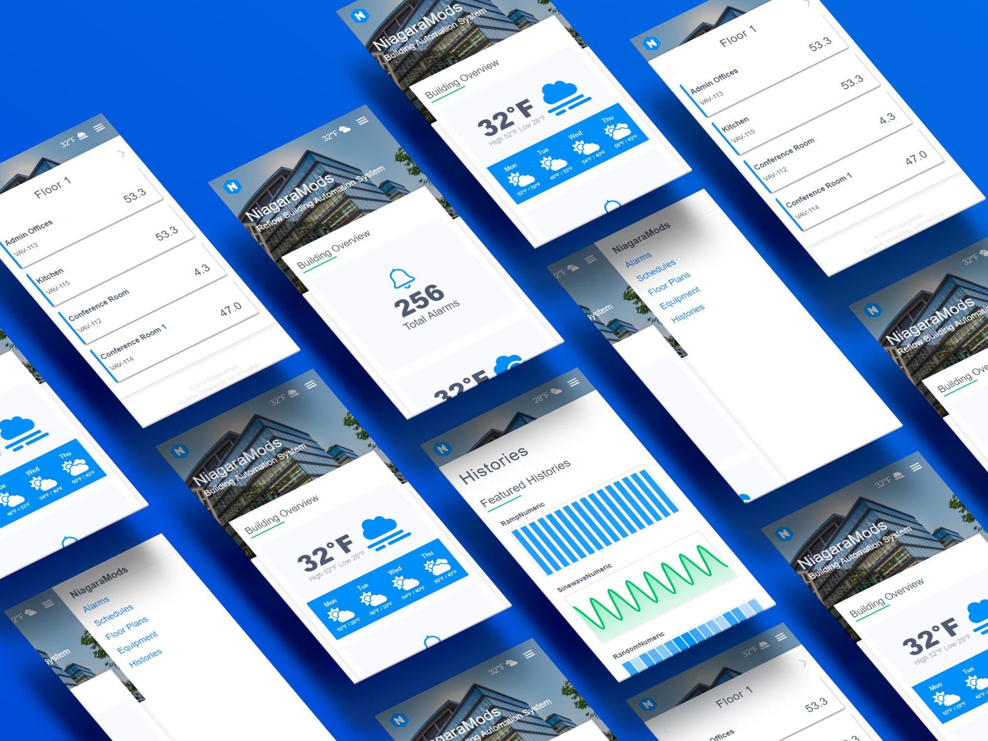
Reflow comes out of the box with a modern user interface and supports many standard features of the typical BAS with zero configuration needed. You'll find that when the tedious steps of system setup are eliminated, you can focus on the fine-grained details of the user experience.
As I've written about previously, branding makes lasting impressions, improves recognition, and creates trust. Companies invest quite a bit of money in making sure their brand presence and standards are adhered to.
The ability to leave behind much of the mundane setup required to carry a client's brand through their building automation system is where Reflow has a clear advantage.
For example, time to focus on what that hero image looks like – Is the text legible when it's on top of the hero image? How about on mobile? Perhaps you need a color overlay on the hero image to make the text jump off the page. All of these decisions will reflect the mood and overall design on the customers site. You could spend 15 minutes or even an hour trying to get this right in the PX editor, in Reflow it can be done in seconds.
A powerful feature in Reflow is the ability to set your client's brand colors in one spot and have that affect other areas of the user interface.
Primary and secondary colors are applied to buttons, dashboard cards, charts, and histories automatically after they're assigned in the color settings.
Here's a quick video demonstrating how easy it is to assign global brand colors, change the title and subtitle, add a logo, set a hero image, and control the background tint in Reflow – all in under 60 seconds.
In the video, you may have noticed that as you're editing content you don't have to leave the tool to see how your changes will look on mobile, tablet and desktop. Use Reflow's built in responsive previews to be sure there are no surprises on smaller screens.
As always, when you're customizing your Reflow interface, make sure you aren't breaking any brand guidelines your customer has established.
Picking the proper pixels
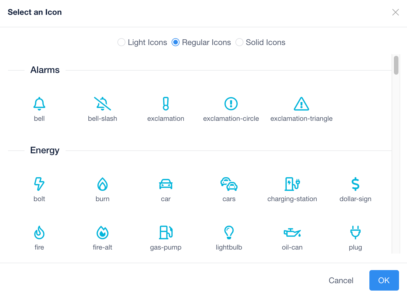
In areas where iconography helps get a point across, Reflow gives you access to a library of relevant icons, with three weights of all icons (light, regular, and solid). This allows you to have a consitent look and feel throughout the expereince and saves time trying to hunt down relevant icons – making your site look great.

Wrapping up
Hopefully this article gives you an idea of the power of Reflow to quickly pull client's branding through to their BAS system. Be on the look out for more blog posts regarding branding in Reflow – next up, we'll dive in to creating stunning dashboards that look as good on mobile as they do on desktops.


