Have you ever wondered why some sites and graphics look better than others? Look & feel plays a big part in users' perception of your work and the most important part of your clients look & feel is their brand.
Branding makes lasting impressions, improves recognition, and creates trust.
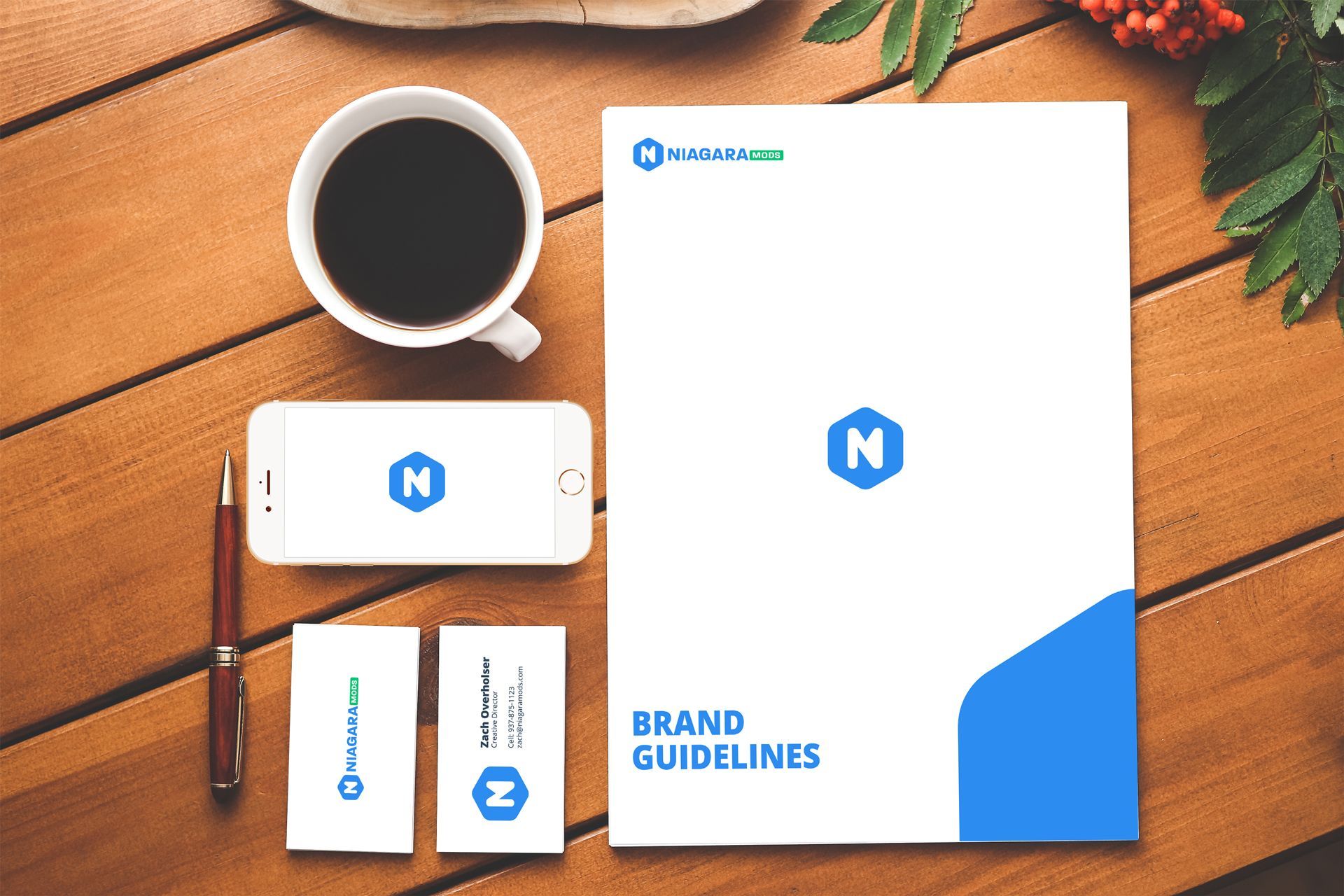
Track down their brand guidelines.
Often times a company's marketing team will be your best bet to finding these assets. Send an email briefly explaining that you're creating a BAS interface/graphics for their company and ask for the brand guidelines. This will go a long way in building something worthy of the brand they've built over the years and it will help you stand out as a forward thinker, someone who wants to represent their brand as best as they can.
What are brand guidelines?
I've heard them called many things including brand standards, style guide, identity guide, and brand books. Regardless of what you call them, brand guidelines are a tool to give a brand the foundation for consistency.
Brand guidelines can cover a number of things like brand personality, attributes, core values, brand essense, visual tone, brand assets etc.
The most important part of the brand guidelines when creating an interface/graphics in Niagara Workbench will be the brand assets: colors, typography, photography, and logo variations - and how and when to use them.
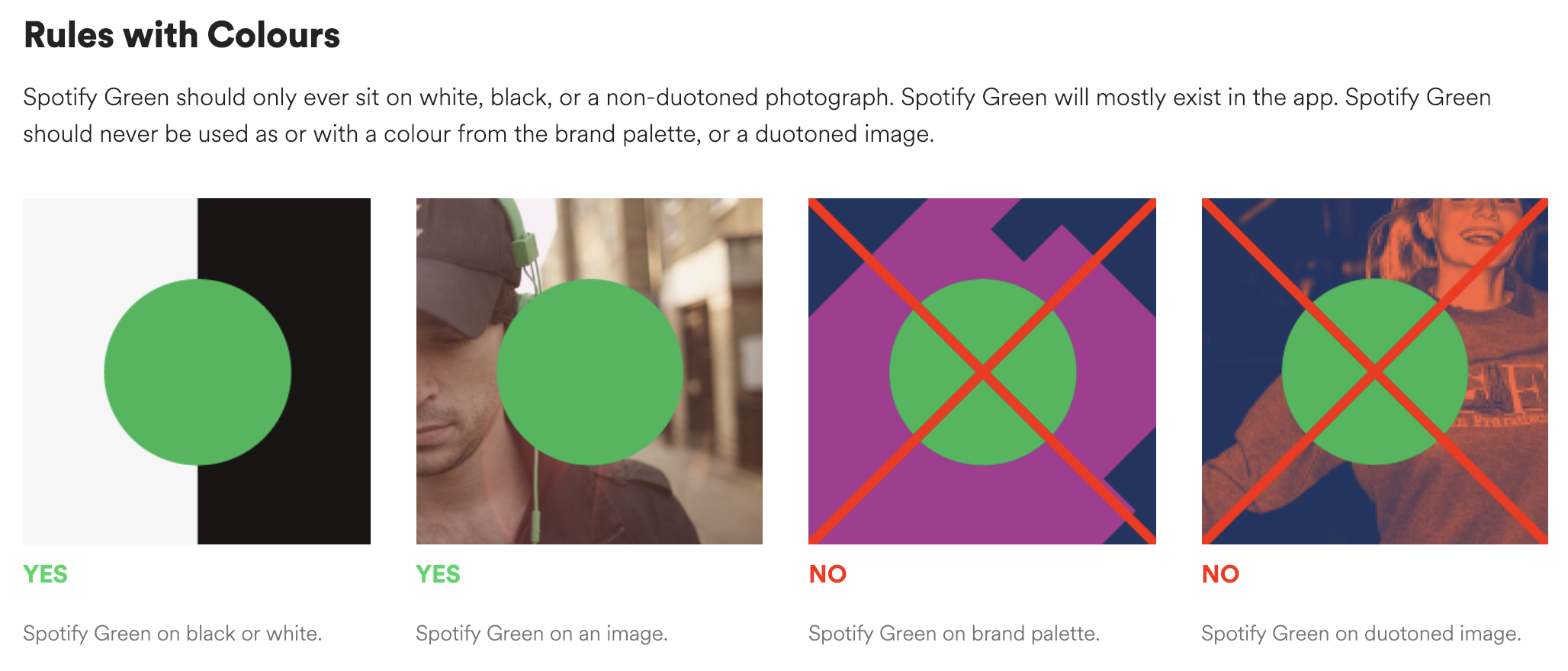
Here is an example of a simple yet powerful brand guideline from Spotify.
Colors
You'll want to get the hex values to make sure you are using the exact colors for the brand. For example: #ffffff (white) #000000 (black). Most brands will have primary and secondary colors, one of their primary colors is often assigned to actionable buttons or navigation.
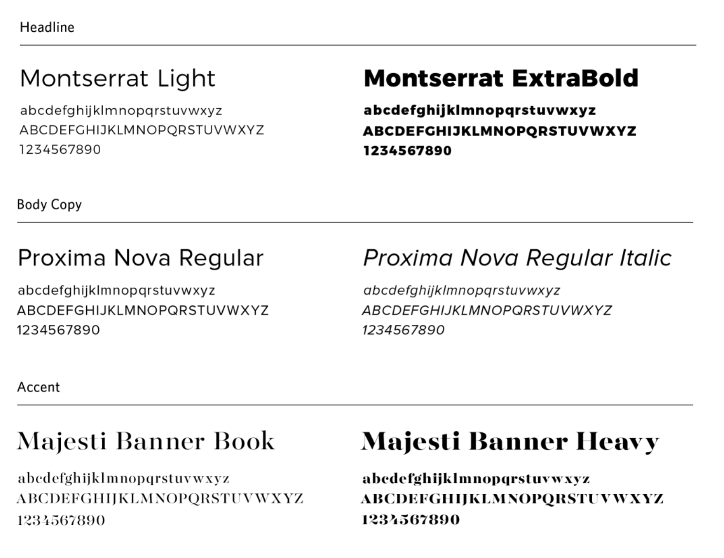
Typography
Fonts are another important element of a companies brand guidelines. Most brand guidelines will assign certain fonts for use on the web or in print materials and have assigned fonts for headlines (titles) and body copy (regular text).
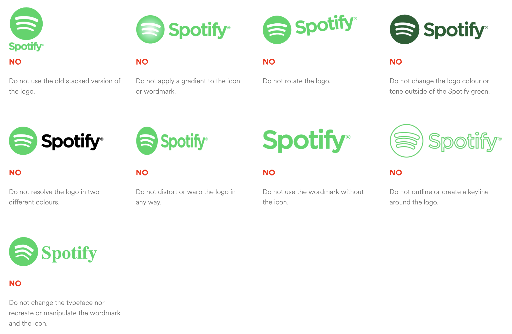
Logos
Most brand guidelines will ask that you avoid the following:
- Changing color of any logotype element.
- Changing the proportions of the logo
- Rotating or skewing the logo
- Adding a drop shadow to any logo element unless authorized.
- Removing any elements of the logo.
Avoid grabbing their logo off Google. It's best to be provided the proper logos from the client.
Imagery
Most clients will have a photo library of acceptable images for use. High resolution (more detail) photography or illustrations can add powerful, engaging elements that when used appropriately and consistently alongside content can have real value.
Avoid grabbing their building photos off Google. It's best to get photography directly from the client.
Put your best foot forward for your client's brand by asking for brand guidelines at the begining of each graphics project. Believe me, your clients will appreciate it.
