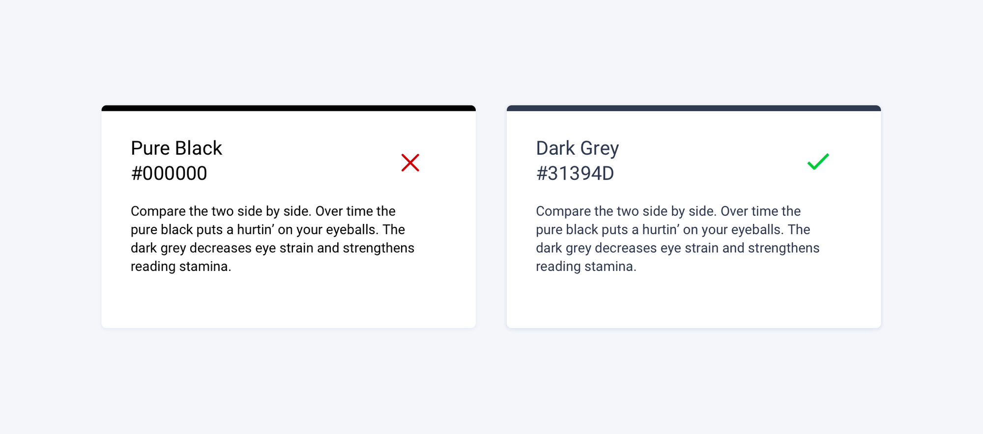
1. Don't use pure black as a font color on white
Instead of using the standard black (#000000) for fonts on a white background, try a dark grey (#31394D).
This simple tip will help reduce stress on the viewers eyes and make your Niagara PX page much more appealing.

2. Add visual interest with icons
Try using icons from the free icon set Font Awesome where applicable. Good iconography can bring a px page together in a way that gives it a bit of polish and finesse.
Using white space or blank space around icons makes them clear and gives them attention.

3. Be consistent
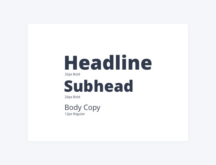
It's important to be consitent. One way you can be consitent is to establish a text hierarchy. This can be accomplished in numerous ways by employing different weights, sizes and styles of a font (e.g. Headlines 32px bold, Subheads 26px bold, body copy 12px regular).
A text hierarchy helps make a layout clear, consistent and easier to digest.
*As a general rule of thumb don't use more than two typefaces on your PX pages.

4. Give content room to breathe
A quick Google search on Niagara px graphics returns many px pages that simply have too much data presented at once. It's important to give content proper spacingso that everything isn't fighting for attention - making none of it elevated.
5. Use neutral colors for the background
If the site you're working on doesn't have brand guidelines and and you're struggling on what colors to choose for the main interface background, default to using a light grey - neutral background color like #fff5f6fa. Adding white boxes on top of the light grey really sets up a clean, modern color scheme.


